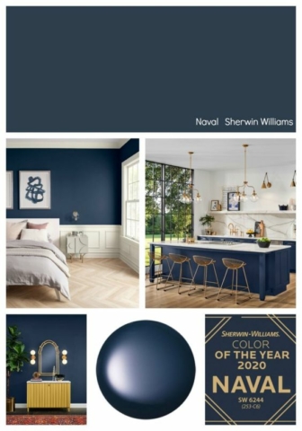
When it announced “Classic Blue” as the paint color of the year for 2020, the Pantone Color Institute, a leading authority on color trends, said: “Instilling calm, confidence and connection, this enduring blue hue highlights our desire for a dependable and stable foundation … as we cross the threshold into a new era.” Really, it just looks blue to me.
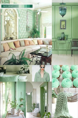
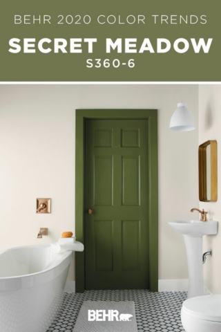
But wait. Behr, Home Depot’s paint brand, declared Back to Nature, as the 2020 COTY (that’s shorthand for Color of the Year), “a restorative and revitalizing green hue that engages the senses.” Probably not the senses of smell and taste.
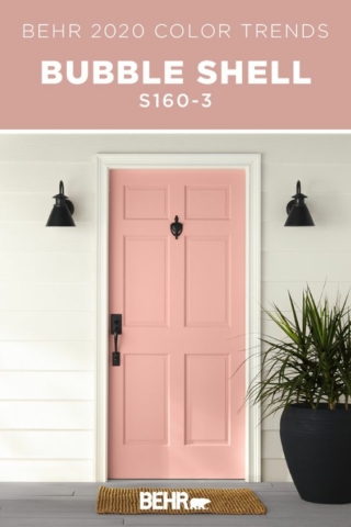
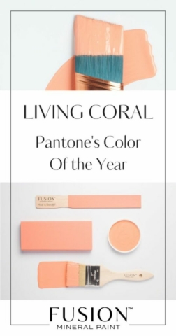
Meanwhile, Benjamin Moore & Co. chose First Light, “a warm, rosy pink that symbolizes an upbeat and hopeful start to the next 10 years.” Well, at least till next year’s color of the year.
Would the real Color of the Year please stand up?
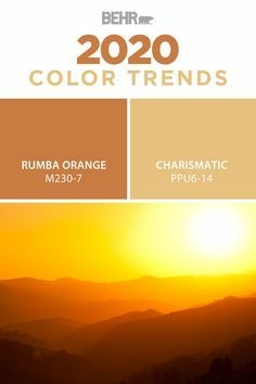
The colorful fad frenzy started when Pantone came out with its first color of the year in 1999. The announcements soon became national news, prompting paint companies to name colors of the year and draw attention to their brands. Now we have nearly a dozen paint companies announcing their COTYs.
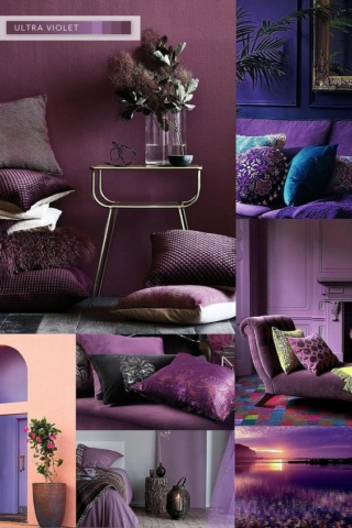
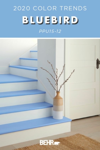
A lot of paint companies list several paint colors of the year.
Nobody in their right mind is going to repaint or redecorate based on one company’s COTY, which will change next year. So, what are we supposed to do with this information? Trends are at their best when they trip an idea, and let you see your space in new ways.
All rooms should have a color that is high in value and one low in value, (something light and something dark), a warm color and a cool one, a neutral and a spike — a punch of something surprising that energizes the space like a pop of green on one wall or behind a seating area, a deep blue, or a pink in the bathroom.

