Paint Colors for 2026

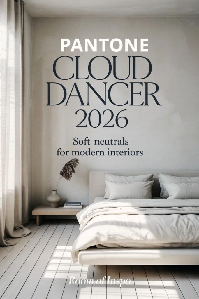
Pantone – Cloud Dancer (PANTONE 11-4201)
Lets dive into the paint colors for 2026. First, think of Cloud Dancer as the perfect “blank canvas” for your home, but with warmth. It’s a soft, airy off-white that feels calm and soothing, almost like a gentle morning sky. Designers love it because it’s incredibly versatile — it pairs beautifully with layered textures, natural wood, and pops of color. This shade is all about creating a peaceful, quiet backdrop in a world that can sometimes feel chaotic, giving your space a serene and timeless vibe.

The image is an advertisement announcing the Sherwin-Williams 2026 Color of the Year, Universal Khaki SW 6150. This mid-tone neutral is described as a warm, versatile, and timeless shade.

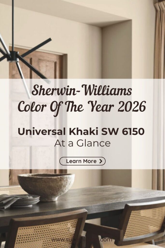
Sherwin-Williams – Universal Khaki (SW 6150)
Universal Khaki is the color equivalent of a cozy hug. It’s a warm, earthy neutral that just feels… right. Designers highlight its grounded simplicity — it works with almost any style, whether your home is modern, traditional, or somewhere in between. It also pairs beautifully with natural materials like wood, stone, or woven textiles. Universal Khaki signals a shift toward interiors that feel cozy, inviting, and authentically lived in.

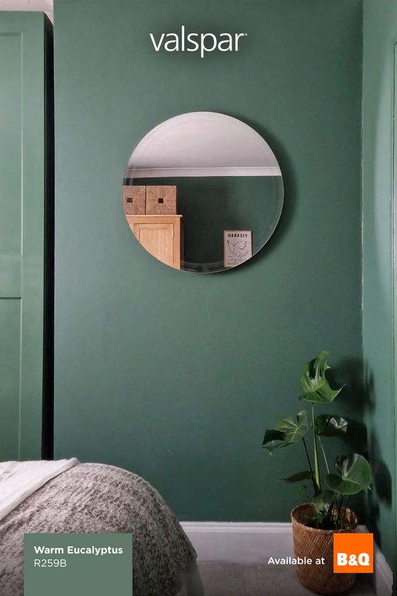
Valspar – Warm Eucalyptus (8004-28F)
Warm Eucalyptus brings a touch of nature indoors. This muted green with soft warm undertones is inspired by the leafy calm of gardens and retro-inspired palettes. Designers are using it in spaces meant for relaxation, like bedrooms, home offices, and bathrooms, because it has a restorative, soothing effect. It’s subtle enough to feel like a neutral, but interesting enough to give your room personality and depth.

The image announces the Glidden 2026 Color of the Year, which is a rich, warm-toned red called Warm Mahogany.

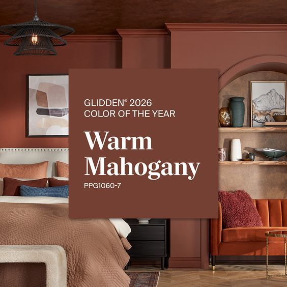
Glidden – Warm Mahogany (PPG1060-7)
If you’re looking to make a room feel cozy and intimate, Warm Mahogany is your go-to. This rich, reddish-brown adds depth and sophistication to living rooms, kitchens, and bedrooms alike. Designers love it for feature walls, cabinetry, or even built-ins because it instantly makes a space feel anchored, inviting, and a little luxurious. It’s the color you turn to when you want warmth and elegance in equal measure.

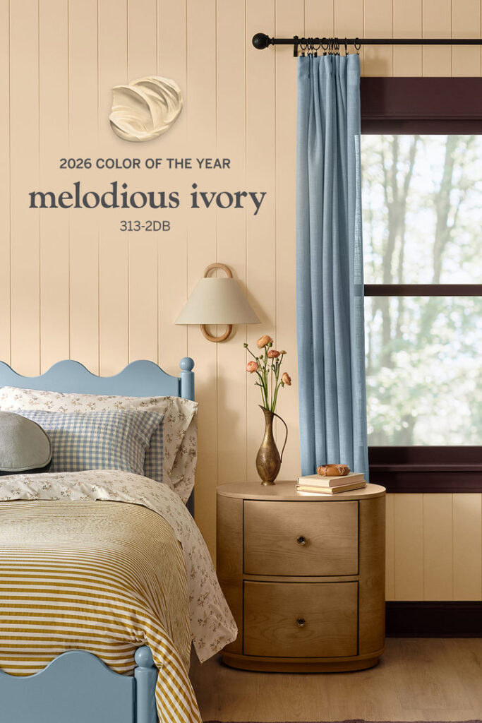
Dutch Boy – Melodious Ivory (313-2DB)
Melodious Ivory is the kind of creamy beige that never goes out of style. It’s soft, timeless, and wonderfully flexible, making it perfect for almost any room or design style — from traditional to contemporary. Designers appreciate how it reflects light, complements textures, and provides a warm, welcoming backdrop for everything from bold artwork to subtle décor. Think of it as the quiet star of your interior palette.

The color featured in the image is Melodious Ivory (shade 313-2DB), which was announced by Dutch Boy Paints as their 2026 Color of the Year. It is a soft, creamy neutral with warm undertones designed to bring a timeless and inviting feel to any space.

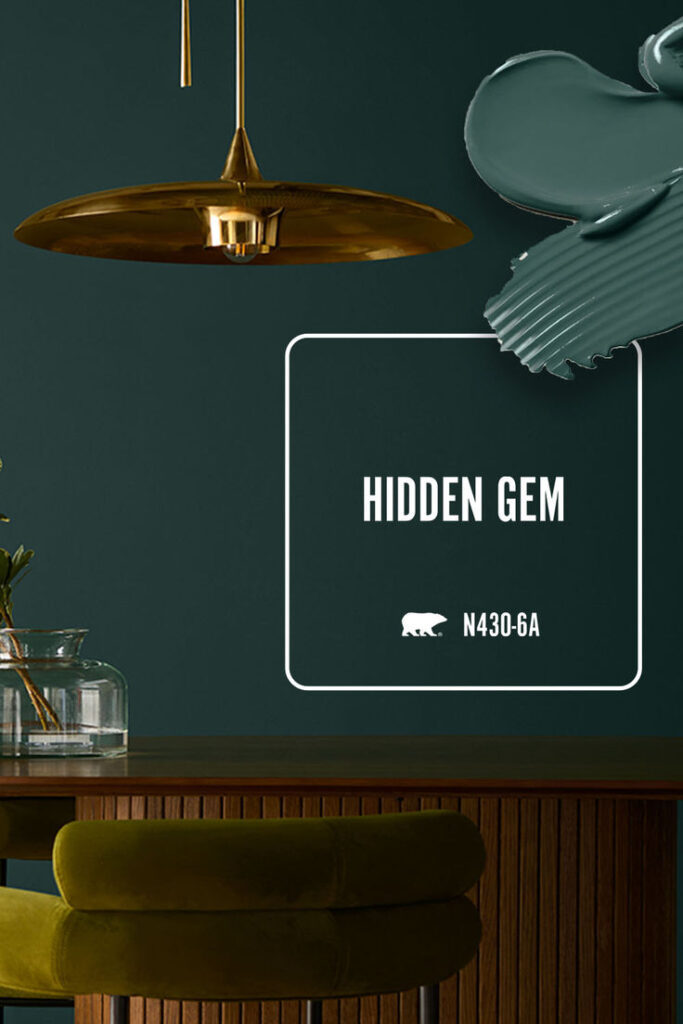
Behr – Hidden Gem (N430-6A)
Hidden Gem is like a little jewel for your walls. This smoky blue-green is sophisticated yet playful, offering a splash of color without feeling overwhelmed. Designers recommend it for accent walls, kitchen cabinets, or spaces that could use a bit of personality. It’s the kind of shade that draws the eye, creates interest, and complements both warm and cool tones in a room.

Retro Kitchens are Making a Comback

Retro kitchens are making a comeback, and it’s easy to see why. Homeowners are craving spaces that feel warm, welcoming, and full of personality. For a long time, kitchen design was all about clean lines, white cabinets, and barely-there color. While those modern kitchens look sleek and polished, many people are now leaning toward something that feels more lived-in and inviting. Retro style brings back the charm of earlier decades and reminds us of family meals, busy kitchens, and the cozy spaces many of us grew up with.

Color is a huge part of the appeal. Instead of sticking to whites and grays, homeowners are embracing fun shades like mint green, butter yellow, cherry red, and teal. These colors instantly brighten a kitchen and add a cheerful energy you just don’t get with neutral palettes. Even one colorful appliance or décor piece can make a space feel playful and unmistakably retro.

Retro kitchen with turquoise cabinets, red countertops, a vintage-style stove and refrigerator, and diner stools.

Today’s retro kitchens aren’t exactly replicas of the past, though. Most people are blending that vintage charm with modern convenience. Think of retro-style appliances that look old-school but work like new, or classic flooring patterns paired with sleek, modern countertops. It’s the best of both worlds—nostalgic style with everyday functionality.

Yellow retro kitchen with yellow diner chairs, a wooden table, checkered floor, and a vintage-style yellow refrigerator.

Another big reason people love retro kitchens is the chance to show off their personality. This style makes room for meaningful, sentimental pieces like a well-worn cookbook, a vintage wall clock, or colorful dishes passed down through the family. These little details tell a story and make the kitchen feel personal, something minimalist designs often leave out.

Blue retro kitchen with blue diner chairs, a chrome table, dark blue floor, and a vintage-style blue refrigerator.

Pop culture has helped fuel the trend, too. TV shows, movies, and social media are full of vintage and mid-century-inspired spaces, and seeing these styles come to life has inspired homeowners to try them out at home.

Mint green retro kitchen with red diner chairs, a chrome table, green and white checkered floor, and a vintage-style red refrigerator.

The good news is, you don’t need a full remodel to add retro flair. Start with classic colors or a patterned floor like checkerboard tile for instant nostalgia. Retro-inspired appliances—even small ones like a pastel mixer or chrome toaster—can become fun focal points. Cabinets with rounded edges, scalloped trim, or chrome hardware add to the look, while accessories like vintage curtains, colorful dishware, and diner-style stools bring in personality. Swapping out lighting for dome-shaped pendants or milk-glass fixtures can also create that warm, retro glow.

White retro kitchen with off white cupboards, retro white oven, and a blue vintage-style refrigerator.

In the end, retro kitchens are popular because they feel happy, personal, and full of character. They blend the charm of the past with the comfort of modern living, creating spaces that feel welcoming and memorable. With just a few thoughtful touches, anyone can enjoy the fun and warmth of a retro-inspired kitchen.

Seed Stands are Going Up

Well, this is the time seed stands are going up, and nursery catalogs are coming to your mailbox. If you’ve ever stood in the seed aisle and wondered why some seed packets cost more than others, you’re not alone. Even though many seed packets look almost the same on the rack, the work that goes into producing them can be very different—and that’s what drives the price.

Seed packets of spinach, lettuce, radish, and beet laying on a table.

One of the biggest factors is the type of seed. Hybrid seeds usually cost more because they’re created through carefully controlled hand pollination to combine specific traits like disease resistance or uniform growth. Open-pollinated and heirloom seeds tend to be less expensive since they reproduce naturally and are easier to grow in large quantities. Rare or specialty varieties often have a higher cost simply because they’re produced in smaller batches. Organic seeds usually come with a higher price tag, too, since they must be grown, handled, and certified under strict organic standards.

Where the seed is grown also makes a difference. Seeds produced in the United States often cost more because of higher labor, land, and regulatory costs. Imported seeds may be cheaper—or sometimes more expensive—depending on shipping fees, inspections, and availability.

Testing and quality control are another behind-the-scenes cost. Higher-priced seeds are often tested more frequently for germination, disease, and purity. That extra testing helps ensure reliable results in your garden, but it also adds to production costs.

The number and size of seeds in the packet matter too. Some packets cost more because they simply contain more seeds. Larger seeds like corn, peas, and beans naturally cost more per seed. Pelleted or coated seeds, which are treated to make planting easier or help protect against disease. This adds to the price.

Packaging plays a role as well. Glossy, full-color packets, moisture-resistant linings, and detailed growing instructions all cost more to produce than simple paper envelopes with basic printing.

Some seeds are just harder to produce. Plants that take longer to mature, produce fewer seeds, like geraniums, require isolation from other varieties, or must be harvested by hand, are more expensive to grow for seed. That extra time and labor are reflected in the retail price.

Where you buy your seeds matters, too. Big-box stores usually offer lower prices because they sell in high volume and operate on smaller margins. Local garden centers often charge a bit more since they carry specialty varieties and provide expert advice. Online specialty seed companies may charge premium prices for rare or unique selections.

Finally, supply and demand can shift prices from year to year. Poor weather, crop failures, shipping issues, or a sudden surge in popularity for certain plants can all drive prices up. Certification and legal labeling requirements also add small but unavoidable costs.

In short, some seed packets cost more because the seeds are harder to produce, more carefully tested, better packaged, certified, rarer, or sold through higher-service retailers. Cheaper seeds are often produced in large quantities with basic packaging. However, they can still grow just as beautifully in your garden.